
Wednesday, December 15, 2010
Art History
At the beginning of this semester I hardly knew any art history. Being an art major, this class has really given me a strong foundation to start my education with. I really enjoyed learning not only about paintings but also about sculpture and architecture!
Sunday, November 21, 2010
Roman and Christian Art
The Pantheon

Built by Hadrian in 118-128 CE, the Pantheon served as a temple to all of the Olympian gods. The building has the normal looking entry of a pediment upheld by Corinthian columns, but what set it apart was the circular part of the building that came right after the entry. Built completely of concrete, the engineers were able to construct a dome atop the rotunda, which became one of the main attractions of this temple. This dome was made so mathematically well, that for years after this and other domes like it were built, people forgot and could not figure out how to duplicate a dome such as the Pantheon’s dome. Although we can all see the Pantheon’s circular features today, it wasn’t that way when it was originally built. The enclosed courtyard around the Pantheon kept the circular shape concealed until people actually walked in and noticed the rotunda and dome. Inside, the floor level consists of more Corinthian columns, plus a few statues. The domed ceiling, which takes up most of the structure, extends high into the sky and is divided up into square coffers. At the very top is a circular oculus 29 ft. in diameter that exposes the inside of the temple to the outside elements. When the sun is shining, the bright, almost heavenly light from above, combined with the open space of the building, provides a feeling of being able to rise right out of the ceiling and up into the heavens.
The Church of Hagia Sophia

In 532-537 CE, Byzantine Emperor Justinian I ordered the construction of the Church of Hagia Sophia, meaning “The Church of Holy Wisdom,” in order to show his earthly power and promote Christian glory. This church combined central and longitudinal planning, with a circular structure in the center, and extensions on the sides that formed a more rectangular structure. This huge structure featured a dome in the center supported by four pendentives. The dome was by far the focal point of the whole church because of the feeling that the dome was almost floating, or held up by a string. Other features of the inside of the church were mosaics of saints and angels, and above the overshadowed altar was a painting of Christ on his thrown. The heavenly and spiritual feeling evoked from the “floating” dome was reinstated by the many clarestory windows that allowed the sunshine to shine throughout the church.
When Christianity began to take over Rome, the spirituality of the citizens and leaders was not the only thing that changed. The elaborate columns and sculptures that adorned the outside of Roman buildings began to be replaced by Christian churches that were less elaborate on the outside, but made up for it on the inside. The Christian churches completely did away with the columned porches seen on many Roman temples. The churches did, however, keep the idea of the dome and circular structures, which can be seen in both the Roman Pantheon and the Christian Church of Hagia Sophia. Although much of the inside of the Roman temples cannot be seen as they were when they were built, we do know that they included life-like yet idealized sculptures of rulers and deities. In the Christian churches, there were less sculptures seen, and most were very unproportional. The church walls were instead covered in mosaics or painting of Christ and saints that did not look quite as realistic as the art of the Romans had.
Monday, November 8, 2010
Parthenon Project
(Her white shoes cannot be seen due to the curvature of the Parthenon)
When looking at the front of the Parthenon, it is possible to notice the slight horizontal curvature in the stylobate. There are many theories for why the architects chose to do this. According to Stokstad, “since long, straight horizontal lines seem to sag when seen from a distance, base and entablature curve slightly upward to correct this optical illusion.” Along with that compensation theory, Pollitt also provides the exaggeration theory, in that the curvature “was intended to amplify normal optical distortion so that the temple appeared to be more immense than it actually was.” The last theory, according to Pollitt, was the tension theory. The architects could have purposely curved it to create tension in the viewer’s mind, which would then “make the structure seem vibrant, alive, and continually interesting.
Sunday, October 31, 2010
Amphora Vessel
Amphora, ca. 530B.C.; Archaic; red-figure
Signed by Andokides, as potter; Attributed to the Andokides Painter (red-figure decoration); Attributed to Psiax (black-figure decoration)
Greek, Attic
Terracotta

Signed by Andokides, as potter; Attributed to the Andokides Painter (red-figure decoration); Attributed to Psiax (black-figure decoration)
Greek, Attic
Terracotta
Amphoras were usually used as large storage jars. This amphora vessel could possibly be one of the first red-figure painting, which was a much easier technique than the traditional black-figure decorations. The scene on the vessel is of Herakles and Apollo's fight over the tripod at Delphi. The top of the vessel is actually made much different than the rest because the white lip is decorated with black-figure painting. This small painting is of Herakles strangling a lion in the presence of Athena and Hermes. The style of the paintings were most likely influences by the pediments of the Siphnian Treasury at Delphi.
Saturday, October 23, 2010
Tuesday, October 19, 2010
Odd Nerdum
http://www.artcyclopedia.com/feature-2004-02.html

Odd Nerdum, a painter from Norway, really lives up to his name. In a time where art is centered around abstract and cubist modernism, Nerdum still chooses to paint a few centuries off, in the Old Masters technique. Of course, being as they all think modernism is the only way to go, art critics have given Nerdum much grief over the years. The author tries to be unbiased but I believe that Paul. A Canton is most likely routing for Nerdum or his article would have been a bit more negative. I think that this article is trying to show that although art is supposed to be a type of freedom of speech and thoughts, there is still a "right" way to do it, and that it is important to fight this thought and do what we want to do.
Monday, October 18, 2010
Greek Funerary Krater
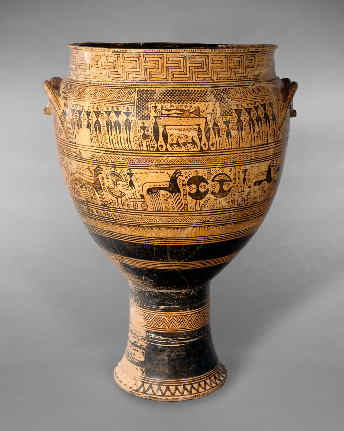
This krater was a typical Egyptian grave marker. The outside is covered in funerary art aimed at the emotions of the survivors, and not as much the afterlife of the dead, as was done in Egyptian art. The paintings depict funerary rituals in which the deceased is shown about to be cremated (a new practice at the time) and others look on in distress at the loss of the loved one.
This ceramic krater represents the art of the geometric period in Greece. The Greeks still shared some Persian culture, and this showed with the Persian-like decorations on this krater. It fits into the geometric period because many of the subjects are painted using geometric shapes, instead of trying to make a representational painting. I think this artists and sculptor had a feel for the formal elements in art, even if they didn't know it. The dark and light of the painting is evenly balanced, and the darker being on the skinnier part really works well. The person who actually made the krater also did well in the shape of it because it really does fill its space well and doesn't look awkward.
Sunday, September 26, 2010
Downtown Presbyterian Church

Saturday, September 18, 2010
Ron Porter
http://nashvillearts.com/2010/08/30/ron-porter-brings-it-into-focus/
I was intrigued by this article mainly because of the interesting first picture. Ron Porter is a local surrealist artist who combines realist landscapes with out of place everyday objects. I thought it was interesting, however, that Porter first started out as an abstract painter. I think although his paintings look very detailed and the landscapes look very realistic now, his previous abstract style is still shown through the abnormal and out of place objects he puts in his artwork. Although we haven't discussed any art like this in class, due to its modern style, some of the elements we learned about are still present in Porter's paintings. Many decisions went into this painting, especially since Porter was not just recreating a scene. He had to decide what exactly he was going to include in it, and when he was going to stop adding objects. He also included a foreground, middle ground, and background, and created a horizontal axis throughout the painting with the horizon.
I was intrigued by this article mainly because of the interesting first picture. Ron Porter is a local surrealist artist who combines realist landscapes with out of place everyday objects. I thought it was interesting, however, that Porter first started out as an abstract painter. I think although his paintings look very detailed and the landscapes look very realistic now, his previous abstract style is still shown through the abnormal and out of place objects he puts in his artwork. Although we haven't discussed any art like this in class, due to its modern style, some of the elements we learned about are still present in Porter's paintings. Many decisions went into this painting, especially since Porter was not just recreating a scene. He had to decide what exactly he was going to include in it, and when he was going to stop adding objects. He also included a foreground, middle ground, and background, and created a horizontal axis throughout the painting with the horizon.
The Palette or Narmer

The Palette of Narmer was a ceremonial version of similar palettes that were used to ground up eye makeup. The top center of the front of the palette is a picture of a fish and a vertical chisel that represents the sounds nar and mer, representing the main subject of the relief sculpture, Narmer. Narmer is shown much larger than the rest of the people represented on the palette to show his importance and power over them, which is also shown by his actions of killing the man in front of him and those already deceased in the bottom section of the palette. The other side of the palette also shows Narmer overtaking the enemies with help from a bull. The whole palette itself represents the unification of lower and upper egypt.
As we moved into the Ancient Egypt section of our studies, I realized it was much different from the art we had been looking at because it was more sculpture than paintings. This particular piece of artwork shows typical egyptian art elements. The artist used iconography, which is the reading of images. It also includes the element of simultaneous narrative because it is not just one complete picture, but of different images of different parts of a story. Lastly, it uses the traditional Egyptian style of the composite pose which was made using a grid, with the figure's shoulders forward and the rest of the figure facing to the side.
Friday, September 10, 2010
Collage Assignment

All of the things I included in my collage mean a lot to me and show how I became who I am. The pictures of people show my family back home and all my friends back home. I even included a picture of my roommates here at Belmont who have become my new friends. The road kind of divides the picture. The top right is my hometown and the bottom left is my life in Nashville. I included my hobbies such as listening to music (the Bob Dylan lyrics and butterfly confetti from Coldplay concert), playing soccer as is shown by the soccer ball, and taking fun photos with my Diana Mini that’s drawn under the Bible verse. Speaking of the verse, I wrote in my favorite verse to show what I believe and that my faith is important to me. I chose the color purple because its my favorite color and I picked blue because it represented the sky in the landscape country drawing. I wrote the verse in red because red it the best color that represents love, and I felt it would help connect it with the red butterfly on the collage.
- Decisions: I chose things that meant a lot to me and that I also thought would be aesthetically pleasing.
- Color: The colors went along with the things I like and what I was trying to portray.
- Light: The dark places were the things of Nashville/Belmont. The lighter parts of the collage were the things of my past. I didn’t choose to do it that way because I was pessimistic about the future, but just because the future is unknown, and the past is so well known and exposed already.
- Texture: The textures in my collage were created by textures in my drawings.
- Volume: I didn’t use cutouts but I tried to use shading and dark areas to create volume.
- Line: I chose to use a diagonal axis and had an implied line along that axis using the road and the placement of the pictures.
- Space: I used the road as perspective and created foreground with the skyline and background with the landscape.
- Scale: Nashville kind of stands out the most because it is one of the biggest part of my life right now because I am adjusting to a new life here.
- Symbolism: Butterflies=Coldplay, Road=Moving, Skyline=Nashville, Country fence=Cleburne, Soccer ball=My love of soccer, American Flag=where I live
- You: My love of Coldplay, my faith, and my favorite sport (soccer) make me who I am today and I represented this by confetti from a Coldplay concert, my favorite Bible verse, and a soccer ball.
- Friends and Family: I put picture of all my friends and family because they definitely play a major part in making me who I am.
- Your town, community, school: I represented my old town (Cleburne) and my new town (Nashville) in the drawings I made. I added a picture of my new Belmont community and school.
- Your country: The flag in the top left corner represents that I am an American.
- The world today: Just the clothes we are wearing and the architecture of the buildings show the style of the world today. The Bible verse is also more of a reminder of how the world should be.
- Art: Art means a lot to me and that’s why I chose to do a lot of drawing in my collage. Art in the world today is expressed through the architecture in the Nashville skyline and by Coldplay because although it is still a different medium of art, it is still art.
- History: The bell tower also expresses the rich history of it. What Belmont has because has changed the rest of my life because I chose to come here. It was also a very big part of history in the Civil War, and it fits into art because if it wasn’t so aesthetically pleasing it wouldn’t be what we center our campus around.
Friday, September 3, 2010
Never Too Old

http://nashvillearts.com/2010/09/01/dawn-whitelaw-a-painters-journal/
This article really stuck out to me because the woman in it paints for her career, yet she didn't even pick up a brush until she was 35. Sometimes I feel as though I can't be a good artist because I am so inexperienced and didn't get the guidance and teaching other students did in their high school years, so it is very comforting to know that it is never too late to get started on art. The artist, Dawn Whitelaw, is most known for her landscape paintings. When reading her description of her steps to making a painting, I couldn't help but think about the element of making decisions that every artist has to go through. Whitelaw has to decide where she will set up to paint, exactly what she will include in the painting, what time of day she will paint, and what colors she will use. Color is a very important element in her paintings. Whitelaw loves how nature makes her feel and she tries to convey that emotion through the bright colors scheme she uses in her paintings. I just felt that this article was so encouraging because you just never know how good you can be at something until you try.
The Parthenon

This week in class we spent quite awhile talking about Frederich Edwin Church's "The Parthenon." At first, this just looks like a picture of ruins, but really, there is so much more to it if you break it down. Obviously the Parthenon was very significant to whoever paid to have it painted, which I find unusual because it was an American by the name of Morris Jesups who lived long after the Parthenon was built. We know this as a fact, not only because we can research that it was painted in 1871, but also because of the clues in the painting itself. First of all, the fact that the Parthenon is in ruins is a big clue that it wasn't painted in ancient times. Also, we know that it was definitely painted after oil paint was invented as this is the medium used. But yet, for some reason Jesups still had some reason to have church make the Parthenon such a glorious-like element of the painting, due to the fact that it is almost dead center, placed on a hill, and illuminated by the light source of the painting.
The painting also reveals a lot about the Church himself. Obviously he was not an amateur artist. This is evident not only because of the obvious skill being that it almost looks as realistic as a photograph, but because of the learned artistic elements embedded in this painting. Church knew how to create a foreground, middle ground, and background, and also knew how to balance out the centered Parthenon with the column on the right of the foreground. Whether the sun was really shining like this or Church just chose to do it this way, he still had a great sense of light, especially when trying to make the Parthenon look as great as he could.
Thursday, August 26, 2010
Starry Night

Although "Starry Night" by Vincent Van Gogh is very popular, it's still my favorite work of art so far. Most artwork is seen to be good if it emotionally moves the viewer, however, I mostly just like this painting because it is aesthetically pleasing. I love blues and greens and I feel that they are the colors, other than yellow, that stand out the most to me. I also love this painting for its texture. The different style of Van Gogh by using short choppy strokes, and not blending the colors is what I believe attracts me the most. So basically, any Van Gogh would be interesting to me, but I think the colors and the fact that I love to look at the the real stars outside is what sets this painting apart in my eyes. And although I was fortunate enough to see other Van Gogh paintings, I have yet to see "Starry Night." In relation to the Horowitz reading, color I believe is a huge element that stands out. The bright yellows contrasted with the dark patches in this painting cause the the stars to stand out. However, I don't think Van Gogh really used color to separate the land in the sky which I think is kind of unusual. To move into another element though, I think Van Gogh's use of lines made the distinction of the sky and land much easier to notice. This also coincides with the texture of the painting in that the choppy, unblended strokes also create curvy lines that create movement throughout the painting. The texture also keeps the painting from being detailed which I think makes it much more interesting because the viewer can then add their own imagination to what the real landscape may have looked like.
I thought I would post a link to a website about Vincent Van Gogh's life because I although I knew he was kind of crazy, it was interesting to see what he had been like before that.
http://www.vangoghgallery.com/misc/bio.html
I thought I would post a link to a website about Vincent Van Gogh's life because I although I knew he was kind of crazy, it was interesting to see what he had been like before that.
http://www.vangoghgallery.com/misc/bio.html
Subscribe to:
Comments (Atom)